Thursday, May 19, 2016

Microsoft Surface Book review

welcom

An amazing laptop that does even more as a tablet

Update: Standing by for the Surface Book successor before capering onto theMicrosoft 2-in-1 bandwagon? You may be waiting around longer than expected. Read on into the "Recent developments" section to find out more.
In its short tenure as a hardware maker, Microsoft has become the defacto trailblazer for Windows-running devices. It all started with the lofty promise that its Surface tablet could replace your laptop. We were skeptical about it three years ago, but after the Surface Pro 3, Microsoft nearly perfected the formula and showed veteran computer manufacturers how hybrids should be made.
Now, Microsoft introduces the Surface Book as the "ultimate laptop." Like the Surface tablets before it, this laptop takes a unique spin on the notebook format that's been around for over 40 years. Between the 3:2 aspect ratio, 13.5-inch screen and its practically-trademarked "dynamic fulcrum" hinge, there isn't any machine on the planet like the Surface Book – and then, with the touch of a button and a gentle tug, it becomes a tablet.
It all sounds like an amazing idea on paper, and with the added "holy shit, Microsoft made a laptop" factor, the Surface Book sounds like a thoroughly amazing device. Let's see just how well Redmond made good on the hype.

Recent developments

After being deemed notorious for bugs by the press, Microsoft has finally resolved the mishmash of issues plaguing the Surface Book last year, bringing it that much closer to perfection.
Released back in February, Microsoft's first attempt at rectifying the Surface Book arrived in the form of a power management update addressing compatibility issues with Intel's Skylake processors. Because Microsoft and its OEMs were still adjusting to the new silicon, these types of issues persisted in a wide range of devices.
It wasn't until April that the infamous driver issues were ironed out. Some of which prevented users from waking up their Surface Books from sleep mode, while others froze up cameras to prevent Windows Hello logins. Over a dozen new drivers were released on April 19, finally putting to rest most (but not all) of the concerns over narcoleptic laptops and bricked webcams.
By mid-May, Microsoft delivered another firmware update full of even more driver amendments for components, like the built-in Microsoft Camera and the Surface Book's Intel processors. This addressed most of the major complaints surrounding the Surface Book, save for the irreparable hardware concerns. Those will come later, presumably next Spring when the Surface Book 2 is rumored to launch alongside a major Windows 10 overhaul.

Design

If a tear in the space-time continuum were to suddenly rip open, two things would fall out: the Terminator and then the Surface Book quickly tumbling to the Earth behind it. From the snake-like hinge, the flat design and even down to the washed-out silver color of this laptop, everything about it just seems like it came from the future.
Milled from two solid blocks of magnesium, the Surface Book feels sturdy and has a most minimalistic style unto its own.
From keyboard deck to the palm rests, the entire interior of this laptop is one flat surface of metal, save for the large space reserved for the glass touchpad. Similarly, the screen lid is made of one uninterrupted slate of magnesium, with its only extra flourishes being a mirror-finished Windows logo in the center and a rear-facing camera.
Along the chiseled sides, you'll find two flat edges that start from the top of the display and terminate at the tip of the palm rest. That's not the only seamless transition.
Unlike most other convertible devices, the screen and base sections share nearly the same thickness and weight. Without the foreknowledge that the display can actually detach, the Surface Book looks like one continuous device, thanks to the hinge.
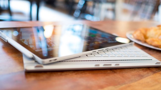
Mind the gap

At the midpoint of the Surface Book, there's a piece of connective tissue that Microsoft calls the dynamic fulcrum hinge. On top of simply gluing the screen and keyboard base together, it's this key piece that makes the whole device work.
Rather than folding flatly, the hinge basically coils into itself, leaving a noticeable gap between the screen and keyboard when the unit is closed. When opened, this same part rolls out and actually extends the base of the laptop, which in turn helps extend the support base for the tablet portion of the Surface Book (called the Clipboard).
While a traditional notebook display might weigh half a pound at most, the top section of the Surface Book weighs 1.6-pounds, because it contains all the necessary parts to act as a standalone tablet. As such, the hinge has been reinforced and contains extra mechanisms, not unlike the Lenovo Yoga 900's watchband-style hinge to keep it in place.
Surface Book is solid as a rock, and you can even pick up it by the display and shake it about without worrying about the whole thing falling apart. On a flat surface, the screen is held steady in place and even stays put when you have it in your lap.
The only times the screen wobbles are when I'm poking at it with my finger or the Surface pen, but that really comes with trying to operate a touchscreen on any laptop.
And to address the concerns of the gap left in the middle of the system. Yes, there is a substantial open space in the middle of the system when it's closed. No, dust and other bits of nasty will not slip into the interior anymore than with a standard laptop, unless you're a particularly messy person. After a week of using the Surface Book religiously, I can run my finger against the inside edge of the hinge and not find a single speck of dust.
Another plus side of having a laptop that doesn't close completely flush is you'll never find any oily outlines of the keyboard imprinted on the screen. It's a design element that also eliminates the need to seat the keyboard into a recessed area. Instead, the keys on this laptop sit flush with the keyboard deck.
The keyboard itself offers a splendid 1.6mm of key travel that caps off with a satisfying thwack when you bottom out the keys. The trackpad is equally as enjoyable, with it's glass laminated finish. For the first time ever, I found myself interested in using the three-finger multi-gestures to rotate through windows and reveal the desktop.
While this is a tiny element of the Surface Book, few – if any – other Windows notebooks on the market today offer such a tight tracking experience.

Mobilizing the desktop

The Surface Book's other signature trick is the screen can pop off the base with just the tap of a button. Technically, Microsoft is coming late to the 2-in-1 laptop game with various devices being able to do the same, including Acer's Switch family, Toshiba's Click notebooks, some HP devices and the list goes on.
However, no one has made a system as seamless as the Surface Book.
Undocking and attaching the Clipboard is nearly as seamless as the Surface Book's design. After either pressing the eject button on the keyboard or the virtual button in the taskbar, the screen will blink off for a second and then notify you it's safe to detach the screen with one quick tug.
It's fast and simple, however, the timing takes a little getting used to. After you get the prompt to detach the screen, you have to wait for about half a second before you can actually lift the display off its base.
Another unique feature to this notebook is it's the first to integrate a discrete graphics processor, or GPU, into a hybrid system. Tucked underneath the keyboard is a customized Nvidia GeForce GPU that makes this laptop just a bit more capable with media production and gaming.
We've seen this sort of GPU docking technology before in machines like the MSI GS30 Shadow with GamingDock and Alienware's GPU Amplifier solution. Microsoft has improved upon dockable graphics, as the Surface Book just needs a short moment to disengage the extra parts, whereas both the Alienware and MSI solutions require the laptop to reboot completely.
It's a neat feature that allows me to quickly show a friend something cool or when I want to read a digital comic book without having to lug the whole laptop around. But it didn't really click with me until I realized how easily it lets me bring my entire PC to another place without having to disconnect my external monitor, keyboard, mouse, Xbox controller and all my other peripherals at home
It's the coolest mechanic since the saucer separation of the Enterprise-D. What's more, it leaves open a door to expandability. Because the Clipboard iscompatible with all Surface Book keyboard bases, not just the one it shipped with, Microsoft could theoretically come out with future upgrades could be done through new bases. (Or maybe even a desktop rig that interfaces with the display? We can dream.)

Wileyfox Swift review

welcom

When Google debuted its Nexus programme in 2010 the public and press were pleasantly surprised. Nexus devices offered what were, at the time, excellent specs at a less than premium price point, and Nexus phones have enjoyed considerable success.
In the intervening years, however, others have caught up with and surpassed Google in offering a capable smartphone package for less cash. The OnePlus One and Moto G, among others, have made the running, encouraging more and more manufacturers to dip their toes.
That now includes Wileyfox. A British startup headed by the former European boss of Motorola, the firm intends to disrupt the low-to-mid-end space with two well-specced offerings, the Swift and the Storm. And with the two devices costing £129 and £199 respectively, they're definitely priced to move.
But, as the likes of Motorola continue to consolidate their gains in this space, and with Huawei, among others, offering increasingly competitive packages at ever-lower price points, is there room for another player to join the game?

Design

It's no longer acceptable in 2015 to produce an ugly smartphone, no matter the cost. As with many other features that were once exclusive to the premium tier of smartphones, such as the Samsung Galaxy S6 or iPhone 6 Plus, good design is now expected to be found across the board.
The Wileyfox Swift is neither beautiful or ugly. It's the same as all other devices of its ilk – a glass slab with a rear covered in textured plastic. With its (relatively) small 5-inch screen and weight of just 135g it's a comfortable device to use.
Adopting the same line taken by Motorola, Wileyfox has added curves in palm-friendly places, and the back is a nice grippy matte plastic. The more I used the Swift, the more I liked it.
The buttons on the Wileyfox Swift are laid out in a pattern that's become the norm for many smartphones. On the right-hand side of the device are the volume rocker and the power button, both of which feel slightly mushy.
On the bottom there's a micro USB port for charging and connecting to a PC via the provided tangle-free cable. The bottom is also home to dual speaker grilles, of which only the right-hand one actually contains a driver. At the top is the 3.5mm headphone jack.
The rear of the device is home to the 'style' elements of the design: a subtle, burnished WileyFox insignia; a small sunken Wileyfox logo; and a 13MP camera ringed with bronze-effect plastic, along with the dual LED flash.

Above the 5-inch 720p screen are the call speaker and the 5MP selfie cam.
All in all, the Swift makes a middling first impression. Lacking the immediate visual flair of a phone like the HTC One M9, 'premium' was almost certainly not a word that figured in the design brief.

Screen

A smartphone lives and dies by its display – and the panel on the Wileyfox Swift is rather nice. The screen is protected by a sheet of Gorilla Glass 3, making it more resistant to breaking and scratching than the average screen.
More importantly, it means the screen has an oleophobic coating, which isn't something that can be said of every device in this price bracket. This makes day to day use of the device a pleasantly tactile experience, and is good news for fans of gesture typing.
With a resolution of 720p, and at five inches across, the Swift has a pixel density of 294ppi. Though this doesn't quite get into Retina territory, in everyday use the screen is excellent.
Whether as a result of text smoothing or other fancy software tricks, reading on the device is as easy, and as pleasurable, as watching media, which is high praise indeed.
As it's an IPS panel, viewing angles are excellent, as is colour accuracy. The Swift runs Cyanogen (of which more in a moment), so the colour temperature of the panel, and other settings, can be tweaked.
The brightness and contrast of the LCD display can lack the 'pop' of an AMOLED panel, but the display on the Swift is perfectly adequate in both regards.
It's pretty hard to find a 'bad' smartphone display these days, even at the budget end of the market; even so, the Swift's screen does it credit.

Google launches Duo, a video-calling app that's simpler than Hangouts

welcome

Hangouts? What’s that? Google debuted what it called a “simpler” one-to-one video-chatting app on Wednesday at Google I/O, known as Duo.
Duo won’t just be for Android devices—it will run on iOS as well. It complements Allo, a new messaging app also announced at Google I/O that’s partially powered by Google Assistant. Both apps will be available later this summer.
We challenged ourselves to develop a video calling experience that could feel magical every time for everyone,” Erik Kay, an engineering director at Google, said at the Google I/O conference in Mountain View.
Duo performs well even on slow networks. It’s encrypted, and based on your phone number. Duo works wherever you are, Kay said, and it proactively monitors network quality several times a second and switches seamlessly between Wi-Fi and cellular. Duo is powered by two Web codecs: WebRTC, and QUIC. 
Duo also has an interesting and potentially controversial feature: “Knock Knock,” which shows you a live video stream of the caller before the connection is actually initiated. “Not only can you see who’s calling, but why they’re calling, and what they’re up to: A smile, a beach, a newborn baby,” Kay said.
The app appears to be sort of like a live contact page rather than a peep into another person’s life—sort of like a friend waving a pair of concert tickets at you through a window. And once you pick up, Duo puts you right into the call. Here’s a closer look at the experience:

What does this mean for Google Hangouts, Google’s existing video app? We don’t know quite yet. It’s likely that the two will coexist—one for group calling, and Duo for more direct communication.

Wednesday, May 18, 2016

'Magic' Mirror Reveals Body Changes As You Get Fit

welcom

A new body-scanning mirror could soon have you asking, "Mirror, mirror on the wall, who's the fittest of them all?" But unlike the magic mirror from Snow White's tale, this new device will objectively respond with your body dimensions, weight and muscle mass, all displayed on a 3D avatar of your physique.
The device, called Naked, is the first 3D body scanner and fitness tracker designed specifically for people to use in their homes, said Ed Sclater, co-founder of Naked Labs, the California-based company behind Naked.
Naked consists of a mirror, scale and smartphone app. The full-length mirror is equipped with sensors along a black strip, which runs down the side of the mirror. The sensors contain Intel RealSense technology, which uses infrared lightto scan your body. This is similar to what an Xbox Kinect does.
 The scale sits in front of the mirror and rotates 360 degrees in 20 seconds. As you rotate on the scale, ideally wearing minimal, skin-tight, workout clothing, the sensors create 3D depth maps of your body at around 30 frames per second, Sclater told Live Science.
"We stick all those [maps] together to create your 3D body model," he said, which is accurate down to one-tenth of an inch.
 Once your 3D body model, which is essentially a mini black-and-white avatar of yourself, is complete, the image and data are sent to an app that you can open on a phone or tablet. This happens within a minute after you step off the scale. You can rotate your avatar, zoom in on parts of your body and display your body measurements, including body fat percentage.
This measure is calculated using a method similar to a hydrostatic dunk-tank test, which compares how much you weigh in water versus on land to get your accurate volume. If you weigh significantly less in water, meaning you are more buoyant, you likely have a higher body fat percentage, because fat is lighter than water. Naked is "essentially a virtual hydrostatic dunk tank test," Sclater said. But, instead of using water, Naked uses your 3D body map to extract your volume.
The system can also pinpoint changes in muscle and fat for different parts of your body by analyzing shapes, Sclater said. For example, the shape of your arm and thigh will look very different if those body parts are dominated by fat or muscle; fat is generally rounder and less shapely, Sclater said.
The app allows you to understand your body and really see changes, the company said. The app displays bands that stretch across your neck, shoulders, chest, arms, waist and legs and shows their measurements and percentage of muscle and fat. The app saves successive measurements and allows you to compare them to each other, Sclater said. For instance, "If your biceps increase in size but your body fat percentage went down, you can assume that that change is a muscle increase," Sclater said.
Being able to see progress can encourage people and help them to stick with workout routines, Sclater said. In fact, only around 20 percent of people stick with health club routines after joining the sites at the beginning of the year, he said. When he looked into why those 20 percent stuck with their workouts he found that they stayed because they saw progress, "and that progress motivated them to continue," Sclater said.
 To help motivate the 80 percent of people who lose their workout motivation, Sclater and his business partner, Farhad Farahbakhshian, created Naked, aiming to give people a visual context for the changes happening to their bodies, Sclater said. "This product is for literally anyone who wants the knowledge to take control of their health and wellness," Sclater said, whether it's the casual exerciser to the goal-oriented athlete.
Sclater and Farahbakhshian said they have received positive responses from people who have tried Naked. Almost every person who has tried the system has said, "Wow, I look better than I thought I did," Sclater said. It seems that an objective view is always better than people's perception of themselves, he added.
Naked can be pre-ordered now for a reserve price of $499 with a deposit of $95. The cost will gradually increase over the next 10 months until it reaches the retail price of $999, according to the company. The first shipment is expected in March 2017, Sclater said.
 

Fiio X7 review: A portable digital audio player designed for high-resolution sound

welcome

The X7 provides access to files and formats that some players—incuding Apple's—don't support.


While iTunes is popular, you might not use it because you want to listen to high-resolution music files, or files in formats that iTunes doesn’t support. That also means you use a portable music player that isn’t iOS based but is capable of handling a wider range of files, including high-resolution. Audio files of this type are often distributed in FLAC format (though it’s easy to convert FLAC files to Apple Lossless files and use them in iTunes), or even Direct Stream Digital (DSD) files (a format created for Super Audio CDs, and now sold as downloads from some vendors), which offer an even higher resolution than what's available in more common formats.
A number of portable audio players support these audio files, and Fiio, a Chinese company with a solid reputation for low-cost, high-quality audio hardware, has a full range of such devices. The latest is the Fiio X7 ($769 MSRP, $600 on Amazon), an Android-based device that supports nearly all the commonly used audio formats: MP3, AAC, FLAC, Apple Lossless, WMA, WAV, AIFF, APE, and OGG at sampling rates up to 384kHz and up to 64-bit resolution, as well as DSD up to 5.6MHz.

Heavy-duty feel with microSD support

The X7 comes with 32GB of internal storage, and you can add up to 128GB on a microSD card. As with any such device, its actual storage is limitless, because you can have as many microSD cards as you want. You could have one card for your rock music, another for jazz, another for classical, and so on. This is important because of the size of high-resolution files: as an example, you'd need about 300MB of space to store a Mahler symphony ripped from a CD and encoded as a FLAC or Apple Lossless file. You'd need about 2.3GB to store that same music as a two-channel, 2.8MHz DSD file.
This aluminum alloy device is heavy in the hand—at 218 grams (7.7 ounces) that’s 50 percent more than the iPhone 6s, or nearly the weight of two iPod classics. The main body of the device, without the amplifier module, is about the same size as an iPod classic, but much thicker. The build quality is nice, except for the bulge on the back (similar to that of Apple’s iPhone charging case) and the display that isn’t flush with the device’s body. But you don’t buy this for its thinness; you buy it for its ability to play all your music, if you do have a collection of this sort of audio file.
he device ships with a headphone amplifier module connected to the bottom with screws. You can also purchase other amplifier modules, such as Fiio’s AM5 high-power amplifier module ($99 on Amazon), if you need to drive headphones that need more juice. The device has a standard 3.5mm headphone jack, as well as a 3.5mm line out/digital coaxial jack (an adapter is included). As such, you can use the X7 while connected to home stereo equipment; you can even use it as a digital-to-analog converter (DAC) connected to a Mac via USB, outputting audio from one of the jacks. You can also buy Fiio’s RM1 Bluetooth remote control ($25 on Amazon) to control the device, which would be ideal if you are connecting it to your home stereo, and the device can stream over Bluetooth to speakers or headphones.

Hands-on with the X7

You control the device’s apps with its touchscreen, but there are also hardware buttons on either side of the X7. By default, the left side has volume up and down and a power button, and the right side has next/previous and play/pause, but you can change the configuration. These buttons are active even if the screen is locked, unfortunately, and it’s easy to accidentally press the next or previous button, or pause playback.
One problem with this device is that the only documentation (other than some FAQs and videos on the manufacturer’s website) is all in Chinese, so it takes a while to figure out how to do anything other than play music.

You can download apps to the X7 using the Google Play Store. I was able to install the Apple Music app, and you can download apps for Spotify and other music services. You can download other apps if you wish to use this device as more than just a music player.


Playback is a bit clunky. You essentially navigate a file system, with folders and files, and you tap one to start playing. When I tap a song, I sometimes see File Not Found, but the song starts playing a bit later; this happens with high-res files, and it may be because they are larger and the SD card I’m using isn’t fast enough. Overall, the software experience isn’t excellent, but I did get a firmware update during my testing which made things a bit smoother.

What about the sound?

That’s one of the most important elements of a device like this, especially considering its price. The X7 sounds as good as any portable device I’ve heard, but for some headphones, it’s a bit weak. With my 62ohm AKG K702 headphones, I need to push the volume nearly to the max; if you have high-impedance headphones, you may need to combine this device with one of its more powerful amplifier modules. But with smaller, lower-impedance headphones, there’s no problem. The sound is clear and crisp, with a wide, expansive soundstage; it’s not overly bass-heavy or tinny, and you can adjust the sound using a built-in equalizer.
The X7 also offers Pure Music Mode, which you can toggle in the settings screen that displays when you swipe down from the top of the display. This boots the device directly into Fiio’s music player app, rather than loading the Android operating system. I found that the sound was a bit better, and the volume higher, in this mode. But you can’t use any other apps, such as Apple Music or Spotify, in Pure Music Mode.

Bottom line

The Fiio X7 is targeted at music enthusiasts who listen to high-resolution audio, and as such it does its job well. If you’re a casual listener, and especially if you depend on iTunes to manage your music, you’re better off with an iPhone or iPod touch for music, but if you have more complex needs, or if you want to use this device as an external DAC connected to your computer, the Fiio X7 is a solid product with lots of advanced features. It may not be the mythical iPod killer, but for many users, it provides access to files and formats that Apple doesn’t support, and that’s enough.

Tuesday, May 17, 2016

Wemo smart-home devices now work with the Nest Learning Thermostat

welcome

New version of the Wemo app taps the Nest Home/Away Assist feature.

Belkin’s Wemo line of smart-home products will become the latest devices to participate in the Works with Nest program when Belkin releases its Wemo app version 1.15 for Android and iOS devices later this morning. If you own both a Wemo and a Nest Learning Thermostat, you’ll be able to configure your Wemo Switch, Wemo Insight Switch, Wemo Light Switch, and Wemo Maker to control lights and appliances in your home using the Nest’s Home/Away Assist feature.
The Nest’s Home/Away Assist feature uses activity sensors in the thermostat plus the location of your smartphone to determine when your home is occupied or empty. The benefit of using both inputs is that the thermostat can still make that determination if you forget to take your phone with you or if its battery dies.
Wemo users will now be able to program a Wemo switch so that it turns lights off when the Nest thermostat goes into Away mode, and back on again when it switches to Home mode. Belkin suggested other examples, too: A fan could turn on while the thermostat is in Away mode to circulate air while the home is empty, reducing the load on the air conditioner when you come home again. Owners of the hobbyist-oriented Wemo Maker, which lets you control a variety of low-voltage devices (motorized blinds, small motors, and irrigation system, for instance) with your smartphone, can do even more.
Why this matters: The only thing that’s surprising about this announcement is that it didn’t happen sooner. The Works with Nest program launched nearly two years ago. Nonetheless, having leading players in the smart-home market announcing new integrations is always a good thing.

New Windows 10 Mobile preview adds handy web features, but kills Wi-Fi Sense

welcome

It’s not a simultaneous release but Microsoft recently rolled out the mobile version of Windows 10 build 14342. The new build comes to Windows Insiders on the Fast ring less than a week after a similarly numbered build rolled out to Insiders’ PCs.
Build 14342 for mobile isn’t all that different from the PC release we looked at last week. At the top of the change list is the death of Wi-Fi Sense. Microsoft removed the feature from mobile builds just as it did earlier with PCs. Anyone running the stable version of Windows 10 Mobile can expect to lose the Wi-Fi password sharing feature once the Anniversary Update rolls out this summer. Wi-Fi Sense will still offer to connect you to open Wi-Fi hotspots near you, however.
The impact on you at home: The death of Wi-Fi Sense was never a big deal on PCs, as the feature is slated to disappear barely a year into its existence—and no one used it anyway. Mobile users may be a different story, however. In the announcement of build 14342, Windows Insider czar Gabe Aul reiterated that “low demand” and the cost of keeping the feature alive led to its death. That said, Wi-Fi Sense debuted on Windows Phone 8.1 in mid-2014, which means it’s likely that a few of you out there will be sad to see this feature go.

Web tweaks

Build 14342 for mobile also brings swipe navigation to Edge, which will be a huge advantage on phones. Swipe navigation allows you to swipe backward and forward between webpages that you’ve visited on a single tab. Right now, Windows 10 Mobile users rely on the back button to go to the previously viewed page, and moving forward is non-existent.
Lastly, this build also brings some early placeholder functionality for the upcoming “Apps for websites” feature that allows websites to redirect users to an installed app.
The Feedback Hub is also getting the same “smart” features as the PC version to auto-suggest category and sub-category headings based on the title and description of your criticisms.
Microsoft also announced three new phones that are able to receive Windows Insider updates including the Lumia Icon, Blu Win HD LTE 150e, and Blu Win JR 130e. Aul said on Twitter earlier in May that Windows Insider access was coming to the Verizon-only Icon.

The Microsoft Band's new Explore tile is a hiking helper

welcome

There's even a GPS Saver mode that can extend your battery life, while still tracking your progress.

The Microsoft Band wearable has offered tracking for running, cycling, golf, and other cardiovascular pursuits, but it’s lacked a basic hiking component, until now. The new Explore tile even offers something a bit special—an actual “map” on your Band itself, along with comprehensive information such as altitude and even hydration reminders.
Naturally, you can track your progress in greater detail with the Microsoft Health app for Windows phones. Or, in the absence of a Windows phone, Microsoft said Monday it will begin pushing a version of the Microsoft Health app to Windows 10 PCs and tablets this week. (It’s merely existed as a Web app until now.)

In all, the new Explore tile seems to offer a well-thought-out approach to hiking, using its various sensors as a cohesive whole. Because hikes often take several hours—if not all day—the new tile takes advantage of the GPS Saver feature Microsoft turned on in February. The Band 2 (now apparently just referred to as the Band, without the “2”)  is one of the few fitness wearables that tracks your distance based on GPS location, but the constant polling can drain the battery. GPS Saver tracks your progress intermittently, prolonging battery life.
Microsoft also turns on its UV sensor, and will alert you if it thinks you need to apply sunscreen or drink water. It will also send a notification if it senses inclement weather, based on its barometric pressure sensor. Finally, it can use that same sensor to track how far you’ve climbed, as well as the absolute altitude you’ve achieved.
Microsoft even displays a small “map” of your route on the Band itself, so you can see how far you’ve hiked—handy when you're climbing a mountain, say, and returning on the same route. You can even flag points of interest, such as that shady stream you passed, where you can schedule a breather. 
When you’re done with your hike, you can sync your Band with your phone or PC—via the standard USB cable, unfortunately—and dig through all the details. Microsoft said it has turned on some of its social elements as well, so that the Health app displays anonymized fitness information of others who share the same age and Body Mass Index, as a means of motivation.
Why this matters:  It makes sense that Microsoft targeted runners first, then walkers; there were over 45 million runners in 2008, compared to 29 million hikers and backpackers, according to Statista. I’d guess that the number of “casual” walkers is far higher, however, and that a considerable number of them want to know more than just their step count. All in all, this appears to be a well-thought-out addition to the Band’s repertoire.

Now every YouTube video is a VR video on iPhone

welcome

Let the YouTube void take you over once more

For some time, Android users have been able to view the entire YouTube catalog of videos through Google Cardboard. Google's latest iOS app update brings the same functionality to Apple's side of the fence.
Previously restricted to a curated selection of 360-degree videos, Google has flipped the switch to allow the Cardboard feature for every single one of YouTube's millions of videos for iPhone users.
To enable Cardboard mode, which splits the screen in two for viewing with a Google Cardboard headset, tap the screen once the video starts playing in landscape orientation. Tap on the three stacked dots in the top right corner to pull up an overlay where you can tap on the Cardboard logo.
Triggering Cardboard mode will put the controls for the video inside of your viewer. To pause or skip around within the video, tap the screen and physically move the phone to aim at the buttons while viewing through the headset.

If you want to change videos, you'll have to pop out of the immersive experience to queue up a new video.
Android VR is rumored to be unveiled at Google IO 2016 this week. If that happens to be an Android-only initiative, this may very well be the best VR support that iOS are going to get for the time being.

OnePlus 3 release date, news and rumors

welcom

The OnePlus Three needs to be a phone which doesn't settle


Update: Rumors suggest the OnePlus 3 could be launched tomorrow (May 18). The OnePlus 3 has also been spotted in a shiny render, showing off a metal finish.
The OnePlus 2 is a great phone, with a beautiful screen and a brilliantly low price, but there are plenty of things that could have been done better – or just done, full stop.
OnePlus underwent a lot of criticism for losing NFC and it's hoped that will be sorted on the OnePlus Three.
Lots of rumors and leaks are starting to come through for the OnePlus 3, suggesting we may see the phone very soon. Here's all the juicy details we know so far about one of the most exciting phones of 2016.

Cut to the chase

  • What is it? The next affordable flagship from OnePlus
  • When is it out? Probably mid-2016, maybe even the end of May
  • What will it cost? Likely around £239/US$329

OnePlus 3 release date

OnePlus co-founder Carl Pei previously revealed the OnePlus 3 is likely to launch near the end of Q2 2016, which means we should have it by late June.
Chinese site GizmoChina has also had word of a release date of May 18, meaning we may see the phone very soon.
Nothing is for certain yet though. Although Pei has claimed it will be here by the end of Q2 2016, OnePlus has missed deadlines before.
What isn't certain is how readily available the phone will be once it has launched. The OnePlus One, OnePlus 2 and OnePlus X all launched under an invite system and we'd expect the same to happen for the OnePlus 3 considering the company is still relatively small.

OnePlus 3 design

The design on the OnePlus One and OnePlus 2 was largely similar, but OnePlus co-founder Carl Pei has confirmed that the OnePlus 3 will sport a new design.
The most recent leaked image is a high-quality render of the phone, which looks more like the HTC 10 than anything OnePlus has previously made, with a slim, slightly curved metal body in a silver color and antenna bands at the top and bottom.
It largely lines up with other recent leaked shots which show a plain back likely made of metal and an antenna band running along the top. The lack of logo and less polished appearance suggests this might have been an earlier prototype, but it's broadly similar to the render above.
The same source leaked shots purportedly showing the front of the OnePlus 3 and these also line up with the render, showing a (likely 5.0 or 5.5-inch AMOLED) screen, slim bezels and a home button that probably houses a fingerprint scanner.
It's looking likely this will be the design of the OnePlus 3, but alternatively, the OnePlus X, a cheaper phone the company launched last year, may be inspiration for the new design if earlier leaked renders turn out to be true. The images of the phone even suggest the design will come with a glass back like the OnePlus X.
But this time there's a mirrored front screen, which is a strange step for OnePlus.
The leaked renders are also missing a fingerprint scanner, suggesting these may not be real. If OnePlus drops the fingerprint scanner we'd expect it to come up with an iris scanner or something similarly impressive to go in its place.

OnePlus 3 specs

Various OnePlus 3 benchmarks point to the possible specs of the phone. Recently two different ones have appeared, pointing to either 4GB or a massive 6GB of RAM. Another rumor seems to offer an explanation - there will be two different versions.
source has claimed there will be a 4GB RAM version with 32GB of storage while a 6GB of RAM version will cost a little more with 64GB of memory onboard.
If this turns out to be true, that will mean an end to the 16GB OnePlus model. The source who claimed this said the 32GB version will cost a similar amount to what the 16GB OnePlus 2 did though, so you shouldn't expect a big jump in price.
The benchmarks also suggest the OnePlus 3 will have a Snapdragon 820 processor, a 5-inch 1080p screen, 64GB of storage, Android Marshmallow, a 16MP rear camera and an 8MP front-facing one.
That same benchmark also suggests there will be NFC support on the OnePlus 3. That's a big deal for OnePlus customers who missed the technology on the OnePlus 2.
Upon the launch of the OnePlus 2, OnePlus confirmed to techradar it decided to ditch the feature as it "saw most of [its] users weren't using NFC" on the OnePlus One. But things have changed since 2014 and a lot of people will now be using the technology for mobile payments.
One source claims the phone will only launch with 32GB of storage. That seems strange considering the company now only sells the 64GB OnePlus 2 in the UK.
On battery, a source claims the OnePlus 3 will come with a 3500mAh cell rather than the 3300mAh one used on the OnePlus 2. But more recently we've heard it might just have a 3000mAh juice pack. An import listing also shows the phone will include Oppo's VOOC fast-charging technology for the very first time.
That means the OnePlus 3 may be able to charge from empty to full battery in just 15 minutes.
OnePlus 3 price
The big selling point for OnePlus is the price. The OnePlus 2 cost £239 or US$329 (about AU$460) so we'd expect a similar price point for the OnePlus 3.
One source even claimed it could be even cheaper at around US$310 (about £210, AU$409). We'll have to wait until the official announcement to know for sure though.
OnePlus 3 competition
OnePlus launched the OnePlus 2 as the "2016 flagship killer" even though it came mid-way through 2015. It held its own against some of the best phones you can buy, but the spec now looks a little dated compared to the brand new flagship handsets.
There's stiff competition for OnePlus with the Samsung Galaxy S7, LG G5, HTC 10 and the iPhone 6S. In September, we also expect to see the iPhone 7 launch as well.
But then there's both the OnePlus X and the OnePlus 2 as well. Even though both of these phones are older, they'll be cheaper than the OnePlus 3 when it launches and the biggest benefit is they are readily available while the OnePlus Three is likely going to be invite only. At least for a bit.

1. NFC

NFC is perhaps the single biggest omission from the OnePlus 2. It apparently wasn't included because it's not a popular feature, but that doesn't change the fact that almost every other flagship and plenty of lower end phones offer it, not to mention the OnePlus One.
It may also soon get a lot more popular, with Android Pay now launching, so it's a feature that we really hope is reinstated for the OnePlus 3.

2. Fast charging

Quick charging is another thing the OnePlus 2 lacks. It's a little more forgivable than the absence of NFC, since it's a feature that's only quite recently been implemented into phones, but it's also a very useful feature, allowing you to juice up your handset in no time flat.
The OnePlus 2 has a pretty big battery, but once it runs down you could be out of action for a while, so hopefully the OnePlus 3 won't lack it.

3. A better fingerprint scanner


When it works the OnePlus 2's fingerprint scanner is pretty good, but we found it inconsistent. Sometimes it would be less responsive or fail altogether and you can't currently use it to pay for things or log into apps.
Some of those things may be fixed with a software update, but we hope the scanner on the OnePlus Three works well from day one. Though early renders suggest we may not even get a fingerprint scanner on the OnePlus 3.

4. Cool running

The Snapdragon 810 at the heart of the OnePlus 2 has had its share of problems in other devices, with various reports of overheating. Supposedly the OnePlus 2uses an improved version yet it doesn't seem immune to heating up.
If the OnePlus 3 can avoid even getting a little toasty that would certainly be appreciated. Thankfully the Snapdragon 820, which is rumored for the OnePlus 3, is a far better behaved processor.

5. A QHD screen


The OnePlus 2 has a 5.5-inch 1080 x 1920 display and while it's fairly sharp it could definitely benefit from the extra pixels of a QHD screen, especially as it's on the large side.
Hopefully the OnePlus 3 won't get any bigger, it makes more sense as a smartphone than a phablet, but it could certainly afford to pack in a few more pixels. Current rumors suggest it will be sticking at 1080p though.

6. Long battery life

There's a 3,300mAh juice pack in the OnePlus 2. That's pretty sizeable, but then it's also a pretty sizeable phone. In practice you should get through a day on a single charge even if you push it pretty hard, but you're going to want to plug it in at night.
Whether through a bigger battery, a more efficient screen and processor or full-featured power saving modes there's a lot that can be improved here and we hope the OnePlus Three implements those improvements.

7. A microSD card slot


There's no microSD card slot in the OnePlus 2, which instantly renders the 16GB model near redundant for any serious smartphone user. The 64GB one is a better bet, but then you're also spending more money and we have almost 100GB of cat pictures we want instant access to, so a microSD card slot would be a huge help.
Hopefully OnePlus is listening. Its motto is 'Never Settle' after all and with the OnePlus 2 we have to settle for just 64GB of cat pictures. It's not okay.

8. Wireless charging

Not only does the OnePlus 2 lack fast charging, but also wireless charging. This is a technology which is still finding its feet, but for a self-proclaimed '2016 flagship killer' it's a feature we'd expect.
We wouldn't be surprised if a wireless charging case is launched for it, but we don't want a case, we want the tech baked right into the phone. The OnePlus 3 has to have it or OnePlus might need to rethink its marketing, as by 2017 we half expect our phones to fly, while wireless charging should be as common as Bluetooth.

9. No lag


With a Snapdragon 810 processor and up to 4GB of RAM the OnePlus 2 really shouldn't lag, yet while it's mostly lightning fast we have noticed some lag with the home button, which didn't always return us to the home screen immediately.
Hopefully this will be sorted with a software update, but we want the OnePlus Three to be as smooth as silk from day one.

10. A similarly low price

Any issues with the OnePlus 2 will be largely negated by its astoundingly low price tag. Sure, it's not quite entry range, but with a starting price of £239 ($329, around AU$452) it's roughly half the price of phones like the Samsung Galaxy S6, despite packing similar specs.
That's a massive win and for the OnePlus 3 to keep the momentum up it will need to be similarly affordable.


Original Xiaomi Mi Band 2 Connected Bracelet for Android iOS - Black

Specialist in techno products at very low prices, the Chinese firm Xiaomi launches its Mi Band 2. After the Mi Band and Mi Band Pulse, sets ...